This article aims to predict the count of casual users (feature casual), count of registered users (feature registered), and the total count of both causal and registered users (feature cnt) using the multi-regression model.
You can go to this webpage to find the source data day.csv and also you can find Bike Sharing Dataset Analytics -- Daily Data.py here.
Exploring the data
import pandas as pd
day = pd.read_csv("day.csv")
day.head()
instant
dteday
season
yr
mnth
holiday
weekday
workingday
weathersit
temp
atemp
hum
windspeed
casual
registered
cnt
0
1
2011-01-01
1
0
1
0
6
0
2
0.344167
0.363625
0.805833
0.160446
331
654
985
1
2
2011-01-02
1
0
1
0
0
0
2
0.363478
0.353739
0.696087
0.248539
131
670
801
2
3
2011-01-03
1
0
1
0
1
1
1
0.196364
0.189405
0.437273
0.248309
120
1229
1349
3
4
2011-01-04
1
0
1
0
2
1
1
0.200000
0.212122
0.590435
0.160296
108
1454
1562
4
5
2011-01-05
1
0
1
0
3
1
1
0.226957
0.229270
0.436957
0.186900
82
1518
1600
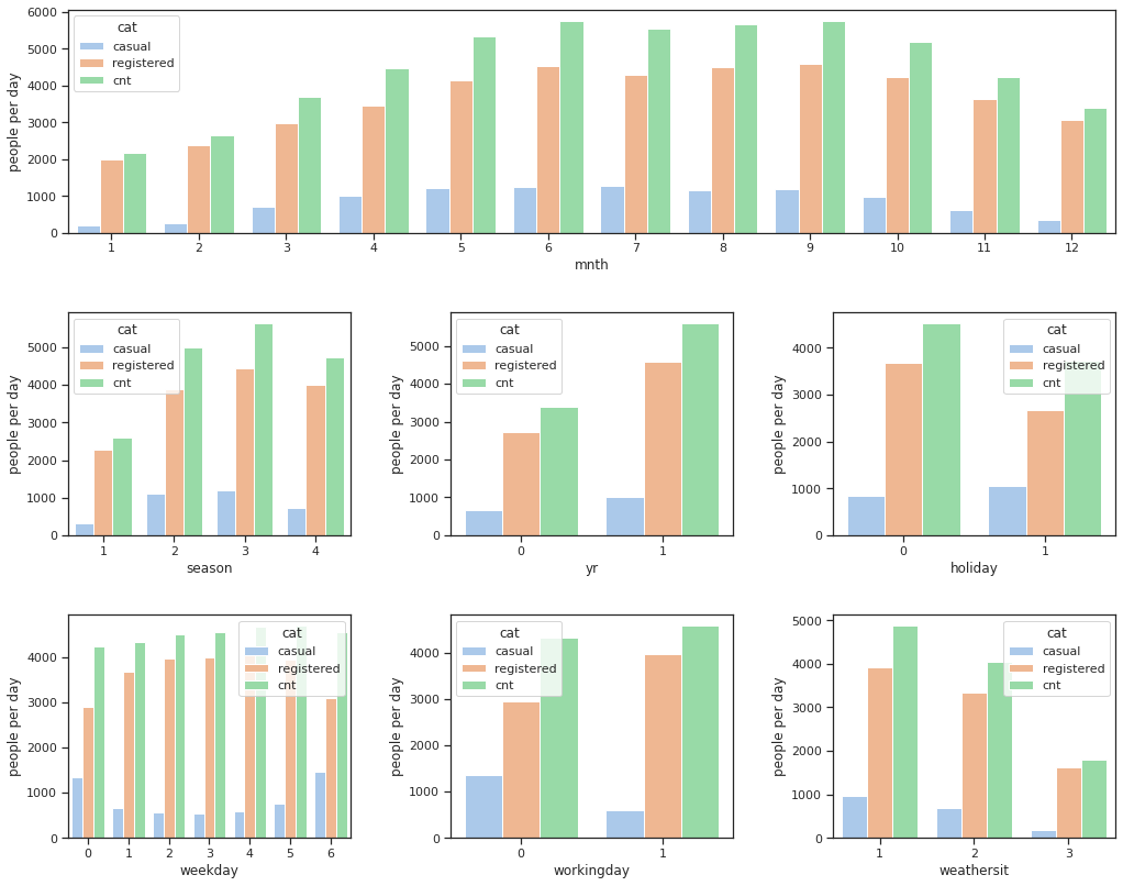
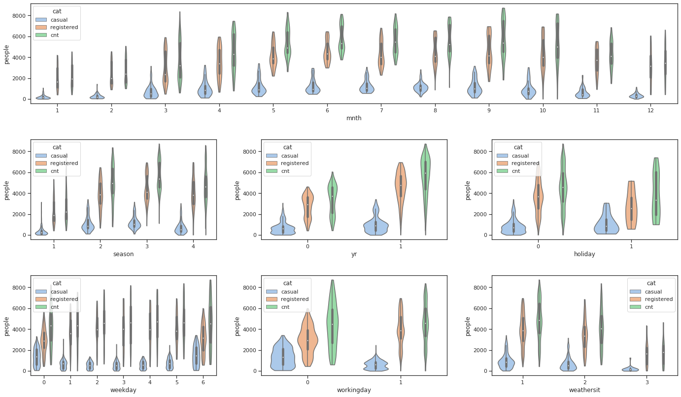
Visualization
import matplotlib.pyplot as plt
import seaborn as sns

result = day[["mnth", "casual", "registered", "cnt"]].groupby(["mnth"]).mean()
result = (
    result.stack()
    .reset_index()
    .set_index("mnth")
    .rename(columns={"level_1": "cat", 0: "people per day"})
)
cat    = ["season", "yr", "holiday", "weekday", "workingday", "weathersit"]

sns.set(style="ticks", palette="pastel")
f, axes = plt.subplots(3, 3, sharey=False, figsize=(15, 12))
ax      = plt.subplot2grid((3, 3), (0, 0), colspan=3)
sns.barplot(x=result.index, y="people per day", data=result, hue="cat", ax=ax)
for ind, val in enumerate(cat):
    result = round(day[[val, "casual", "registered", "cnt"]].groupby([val]).mean())
    result = (
        result.stack()
        .reset_index()
        .set_index(val)
        .rename(columns={"level_1": "cat", 0: "people per day"})
    )
    sns.barplot(
        x    = result.index,
        y    = "people per day",
        data = result,
        hue  = "cat",
        ax   = axes[ind // 3 + 1, ind % 3],
    )
f.tight_layout(pad=3.0)
plt.show()
result = day[["casual", "registered", "cnt"]].set_index(day["mnth"])
result = (
    result.stack()
    .reset_index()
    .set_index("mnth")
    .rename(columns={"level_1": "cat", 0: "people"})
)

f, axes = plt.subplots(3, 3, sharey=False, figsize=(20, 12))
ax      = plt.subplot2grid((3, 3), (0, 0), colspan=3)
sns.violinplot(x=result.index, y="people", hue="cat", data=result, cut=0, ax=ax)
for ind, val in enumerate(cat):
    result = day[["casual", "registered", "cnt"]].set_index(day[val])
    result = (
        result.stack()
        .reset_index()
        .set_index(val)
        .rename(columns={"level_1": "cat", 0: "people"})
    )
    sns.violinplot(
        x    = result.index,
        y    = "people",
        hue  = "cat",
        data = result,
        cut  = 0,
        ax   = axes[ind // 3 + 1, ind % 3],
    )
f.tight_layout(pad=3.0)
plt.show()
The number of people who rental a bike every year is increasing, which indicates that riding bicycle is getting popular. This trend could be got if we fit a model on date and year. But here, since we don't have data of enough years, so we maily focus on the other features in our analysis.